Our logo is more than an image. It beautifully captures the heart of our mission – restoring hope, transforming lives, and shining God’s love into the hearts of children and communities.
The Circular Shape represents unity, wholeness, and the embrace of caring community. Inside the circle, the Uplifted Figure represents the journey from struggle to hope, symbolizing every child and family rising toward a brighter future. It shows growth, dignity, and the power of compassion.
Encircling This Figure Are Three Meaningful Colors
Green
A symbol of growth, healing, and restoration. It reflects the renewal of lives, families, and communities.
Blue
A sign of peace, trust, and accountability. It represents the integrity with which we serve and steward resources.
Yellow (Sun)
A rising light of hope, joy, and new beginnings. It reminds us that even from places of pain, a bright future can emerge.
Love & Compassion – The figure’s form reflects care, comfort, and the protection of the orphaned and vulnerable children.
Faith & Hope – The rising yellow sun symbolizes light in the darkness and strength through belief.
Integrity – The strong blue section conveys trustworthiness, transparency, and accountability.
Dignity & Respect – The circle suggests inclusion, equality, and the value of every person we serve.
o Empowerment – The upward movement represents lives being lifted, strengthened, and equipped.
Community & Partnership – The joined colors show unity, collaboration, and shared purpose.
“Let your light shine before others, that they may see your good deeds and glorify your Father in heaven.” – Matthew 5:16
The Rising Sun In Our Logo Reminds Us That Compassion Lived Out In Action Brings Glory To God And Hope To His people.
Conclusion
This logo holds our mission in visual form. It speaks of children rising, families being restored, and communities transformed through love, partnership, and faith. To every donor and visitor, it offers a promise: Together, with dignity and compassion, we are restoring hope.
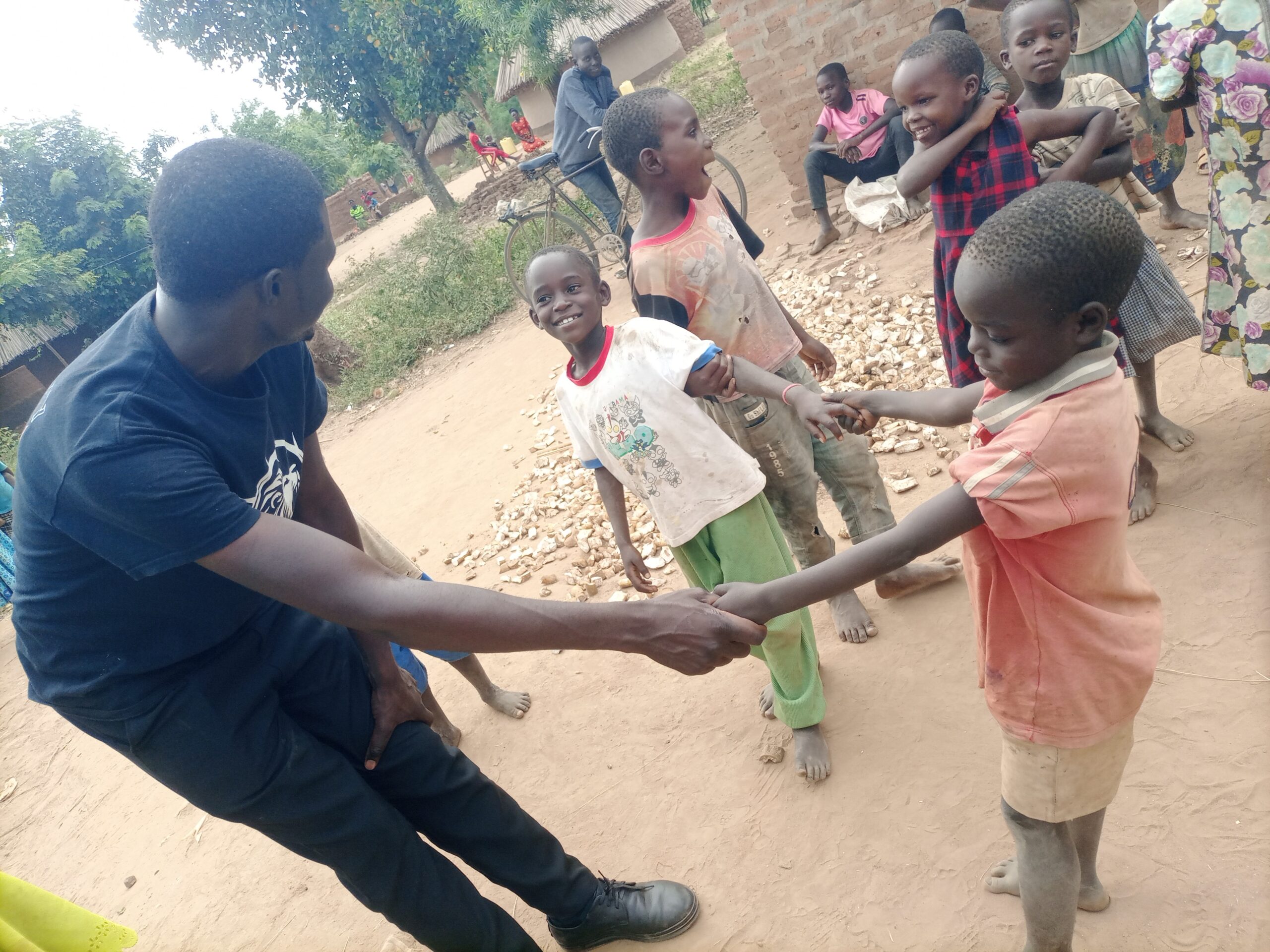
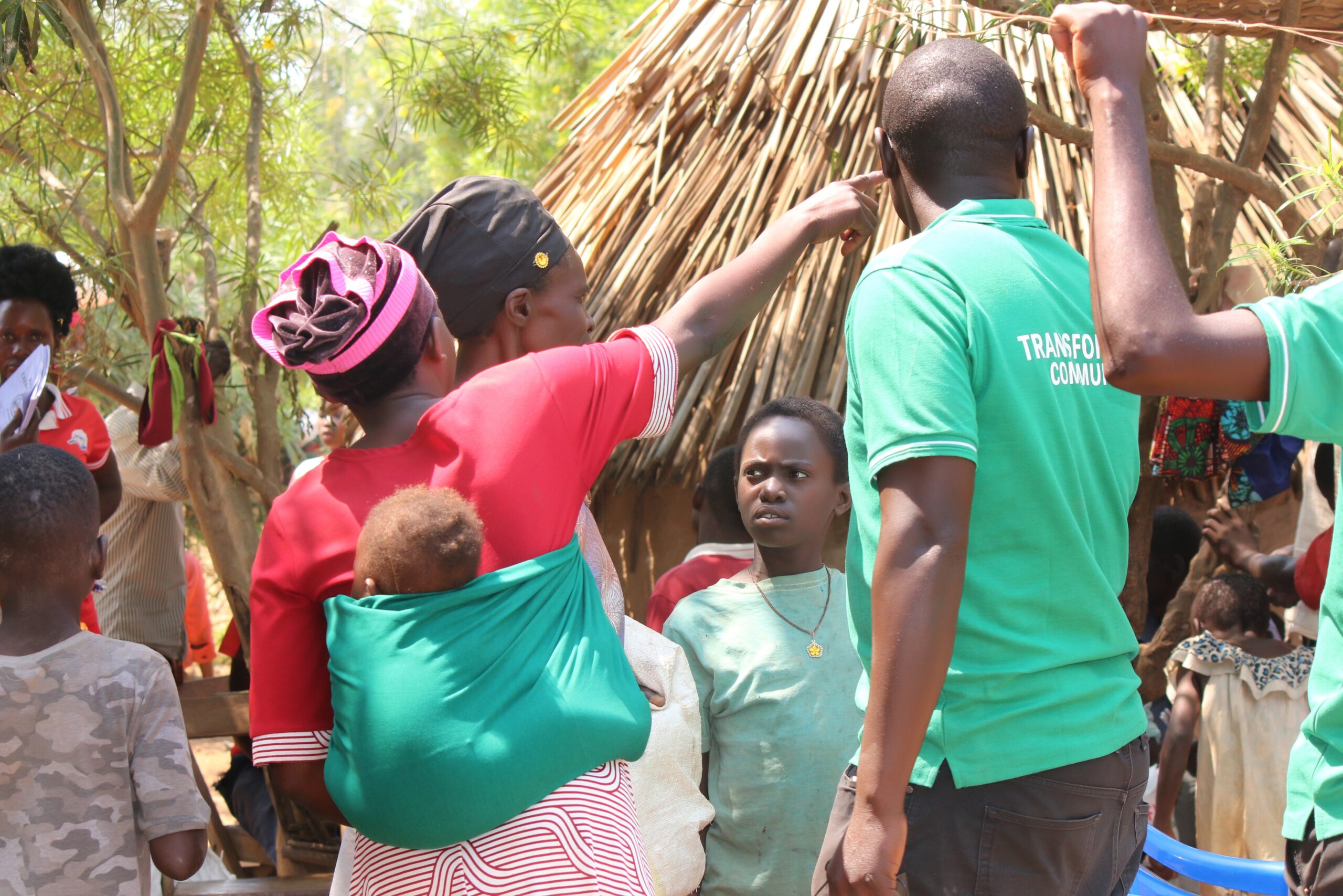
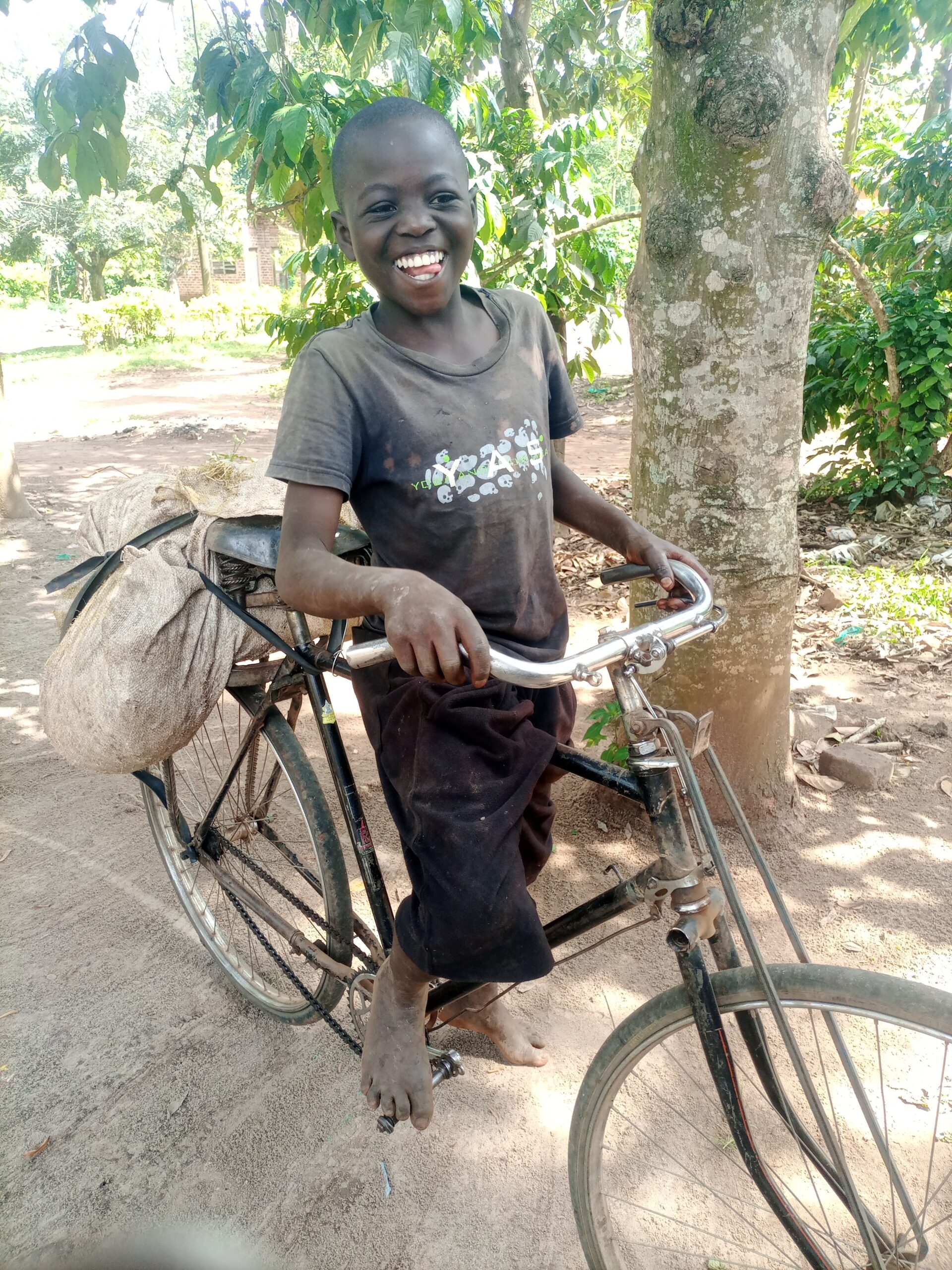
Nissi Project was founded with love, and faith, providing care for vulnerable children. Our mission is simple, to restore hope and empower each child to reach their full potential.)